This collection highlights my work as an editorial art director. I specialize in designing print and digital publications that elevate narrative, clarify ideas, and leave a lasting visual impression. From issue-wide layout systems to bold cover designs, my work balances sophistication, strategy, and creativity—built for journalism that has something to say.
VISUAL STORYTELLING
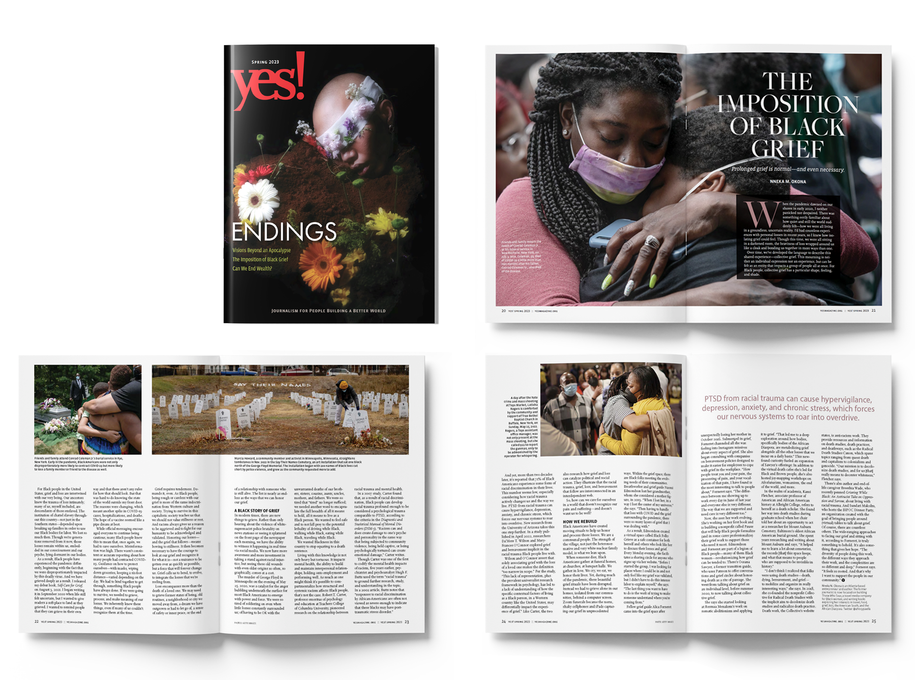
For the Endings issue cover, I aimed to convey that endings aren’t always final—they can create space for new possibilities and potential. The opening image for the “Imposition of Black Grief” feature captured the emotional weight of the loss of life that disproportionately impacted Black communities during the pandemic shutdown. Supporting visuals surfaced the profound, ongoing losses from police violence and racially motivated mass shootings.
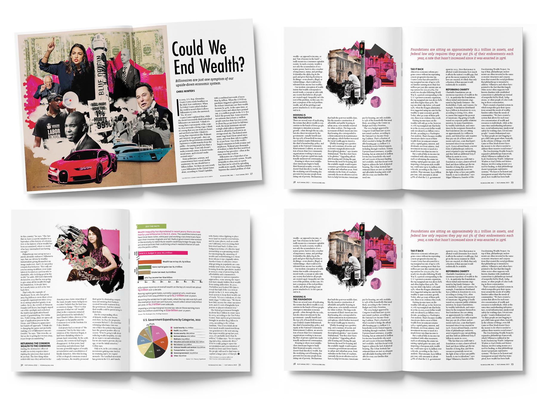
In the same issue, the feature “Could We End Wealth?” called for collage—offering a more nuanced visual language to reflect the story’s complexity. For features like this, I also chart critical data, highlight pull quotes, and incorporate text-based graphics to guide readers through key takeaways.
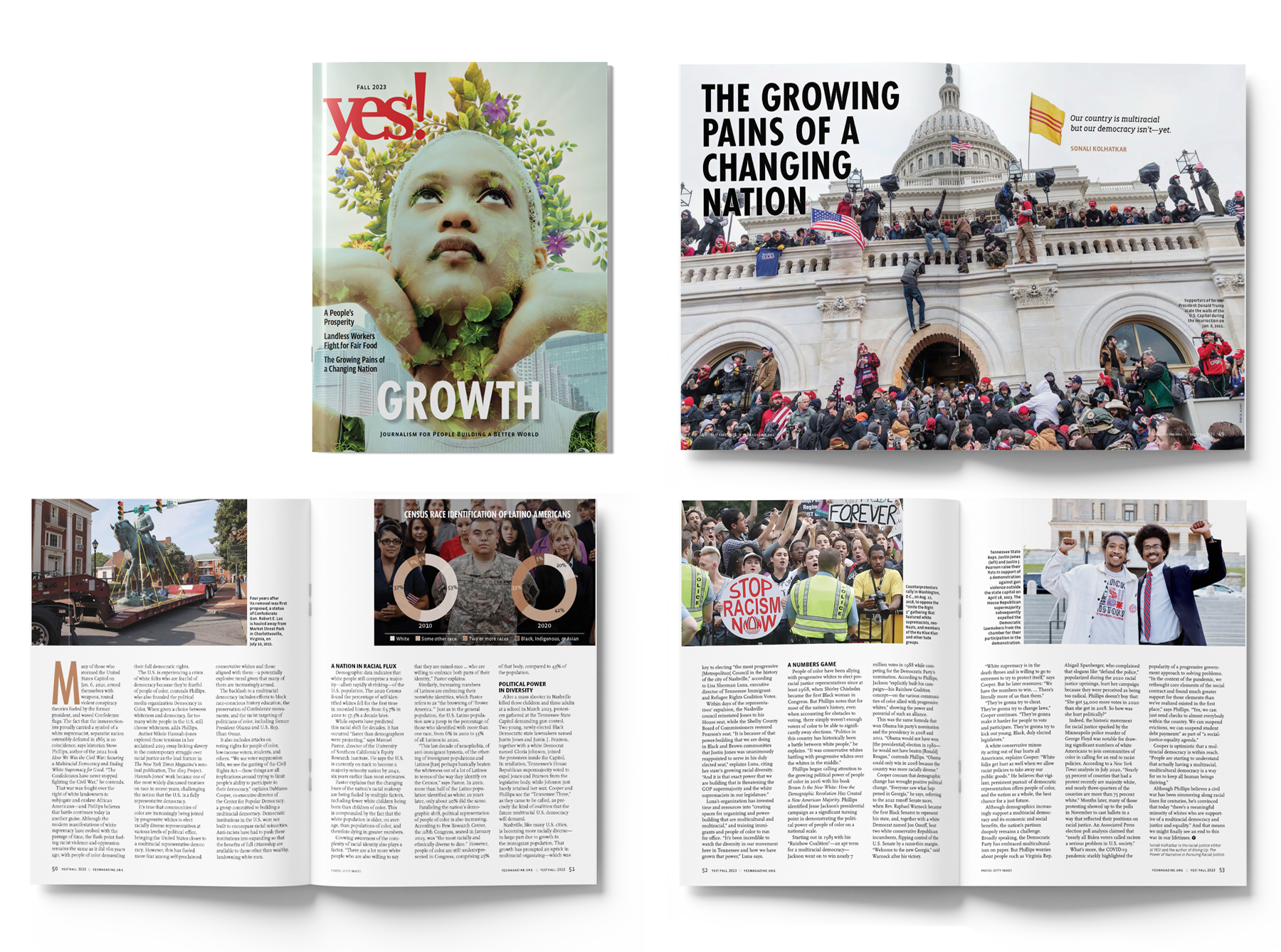
The Growth cover was entirely my own composition—combining three stock images and a still from a video, which I later repurposed into a “cover reveal” animation for Instagram. I also pitched the lead feature, “The Growing Pains of a Changing Nation.” My concept was that the U.S., as an ongoing experiment, is in a kind of adolescence: emotionally volatile, exploring its identity, and struggling to define who it wants to become—what I described as the “growing pains of America.”
For this feature, I selected a lead image that served as a visual reminder of the magnitude of what occurred on January 6, at a time when national memory was beginning to fade. The story expanded beyond that moment to include images of Confederate monuments being dismantled, demographic shifts, immigration, and the “browning of America,” and congressional consequences faced by those taking a stand against gun violence—each visual marking a chapter in the nation’s coming-of-age.
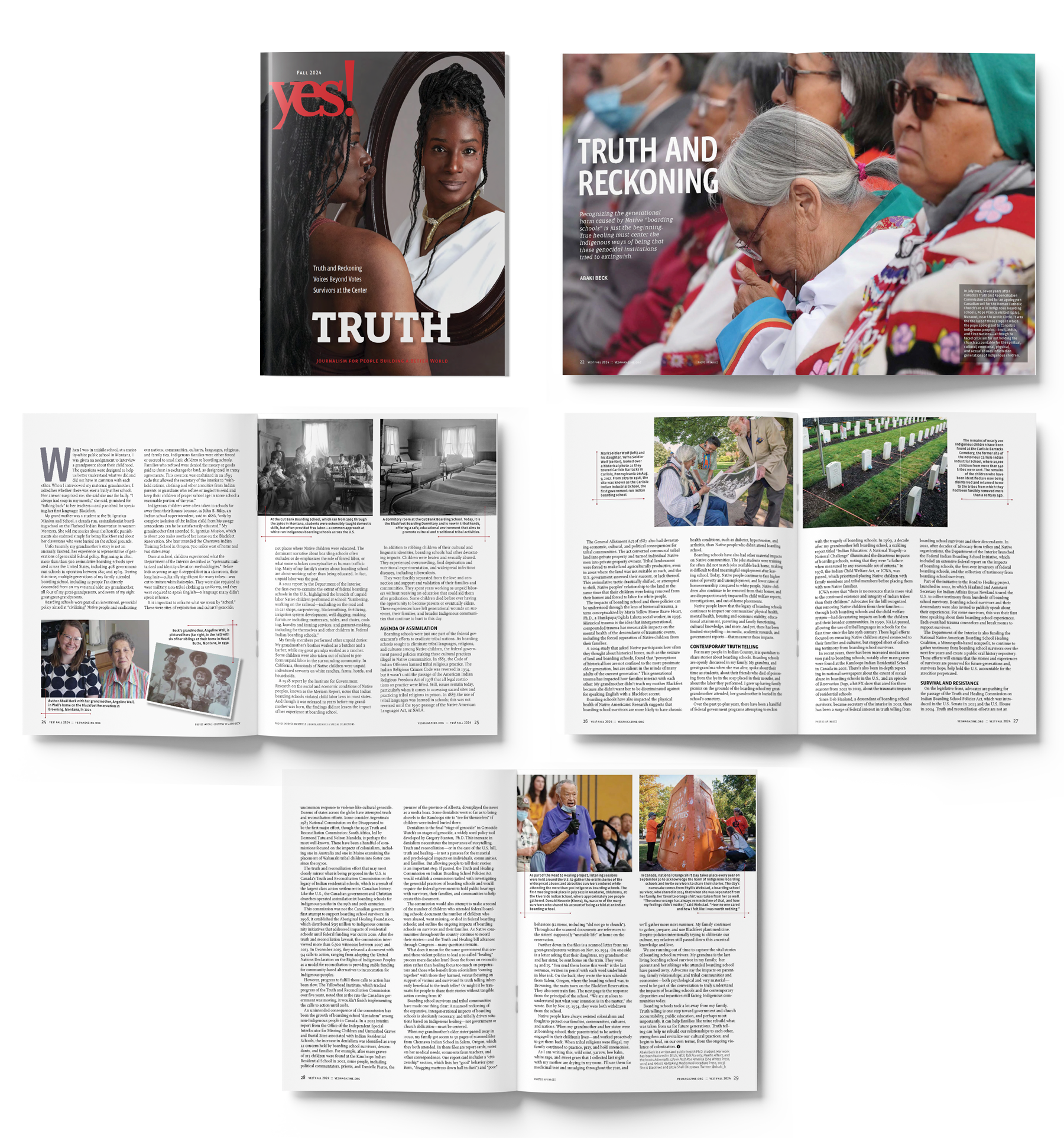
The Truth issue’s cover featured a portrait commissioned from Lakán Angelo Ragaza. It explored truth as the tension between how we see ourselves, how we choose to present ourselves, and how we are seen by others. The image honored the courage of a trans woman living her truth—authentically and unapologetically.
The lead feature, “Truth and Reckoning,” addressed the generational harm caused by Native boarding schools dating back to the early 1800s. I focused on showing the deplorable conditions, the beginnings of reconciliation, and efforts to return children’s remains found in mass graves. The visual language needed to hold space for grief, truth, and the long arc of healing.
MAGAZINE COVERS AND SECTION DIVIDERS
TASK: Thoughtfully incorporate existing images to visually reinforce and enhance each issue’s theme.
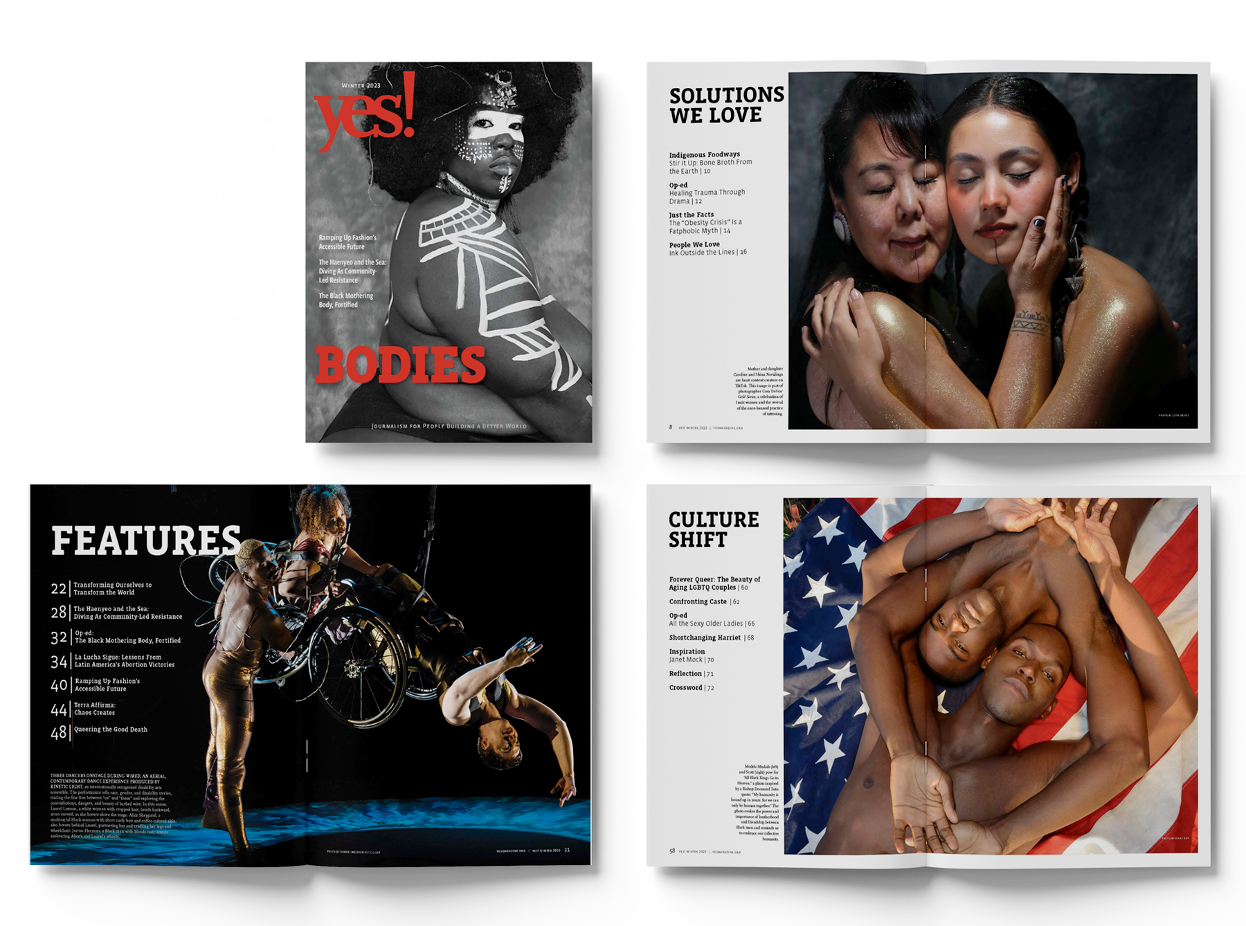
THEME: BODIES (Winter 2023)
This issue launched a bold new visual direction for the magazine with a cover designed to disrupt narrow definitions of beauty, worthiness, and power. These images were chosen as a visual protest—an ode to body autonomy and the radical beauty of those too often erased. Fat, Black, Indigenous, disabled, and queer bodies take center stage here: powerful, sensual, sovereign, and wholly their own.
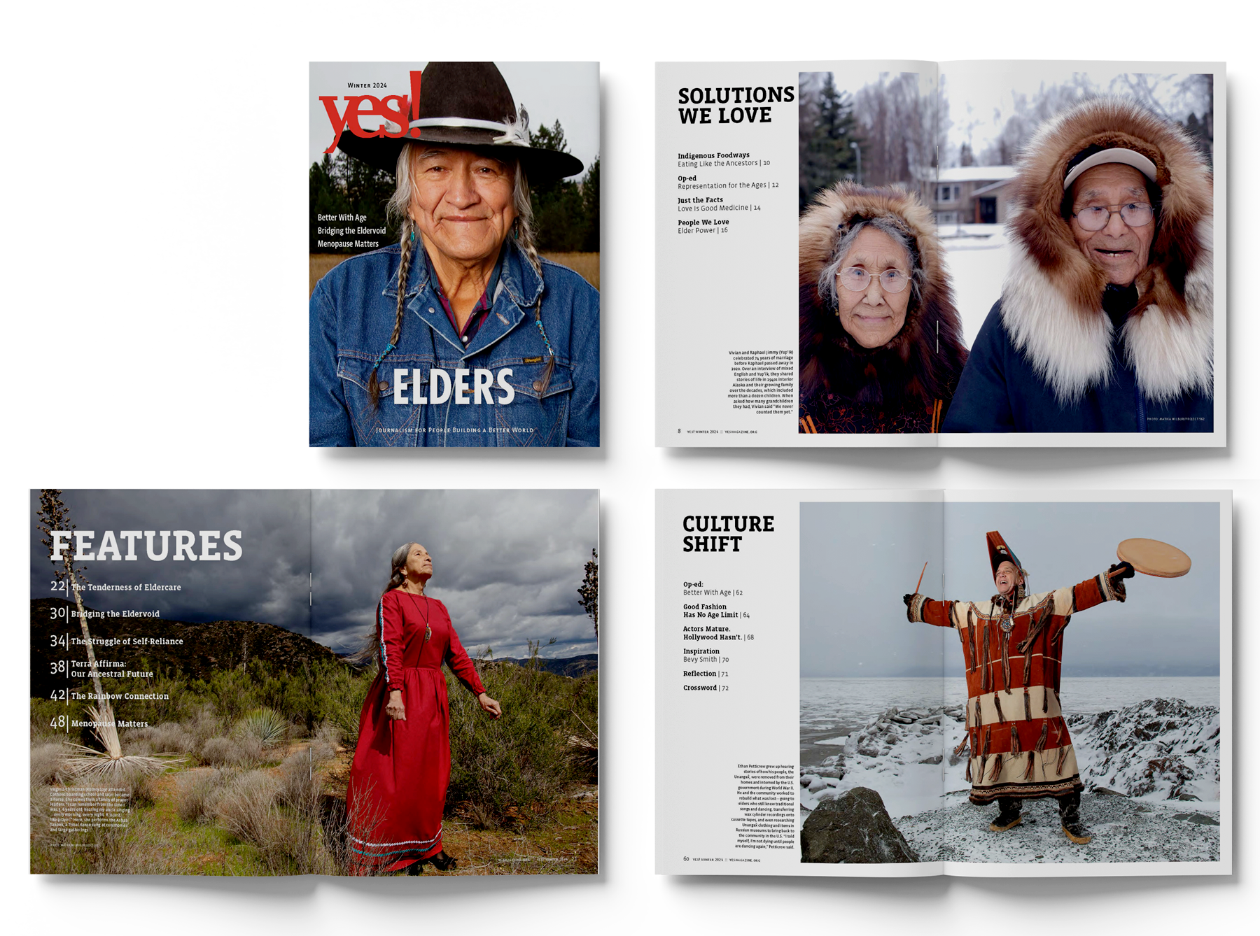
THEME: ELDERS (Winter 2024)
To honor the wisdom-keepers among us, I chose portraits by Matika Wilbur—images that radiate reverence, resilience, and ancestral continuity. These elders are storytellers, dancers, language bearers, and protectors of memory. Some had passed on by the time we published, but their presence remains vivid. I fought to bring these images to our pages—not just for their beauty, but because they embody a sacred responsibility: to remember, to respect, and to carry forward what must not be lost.
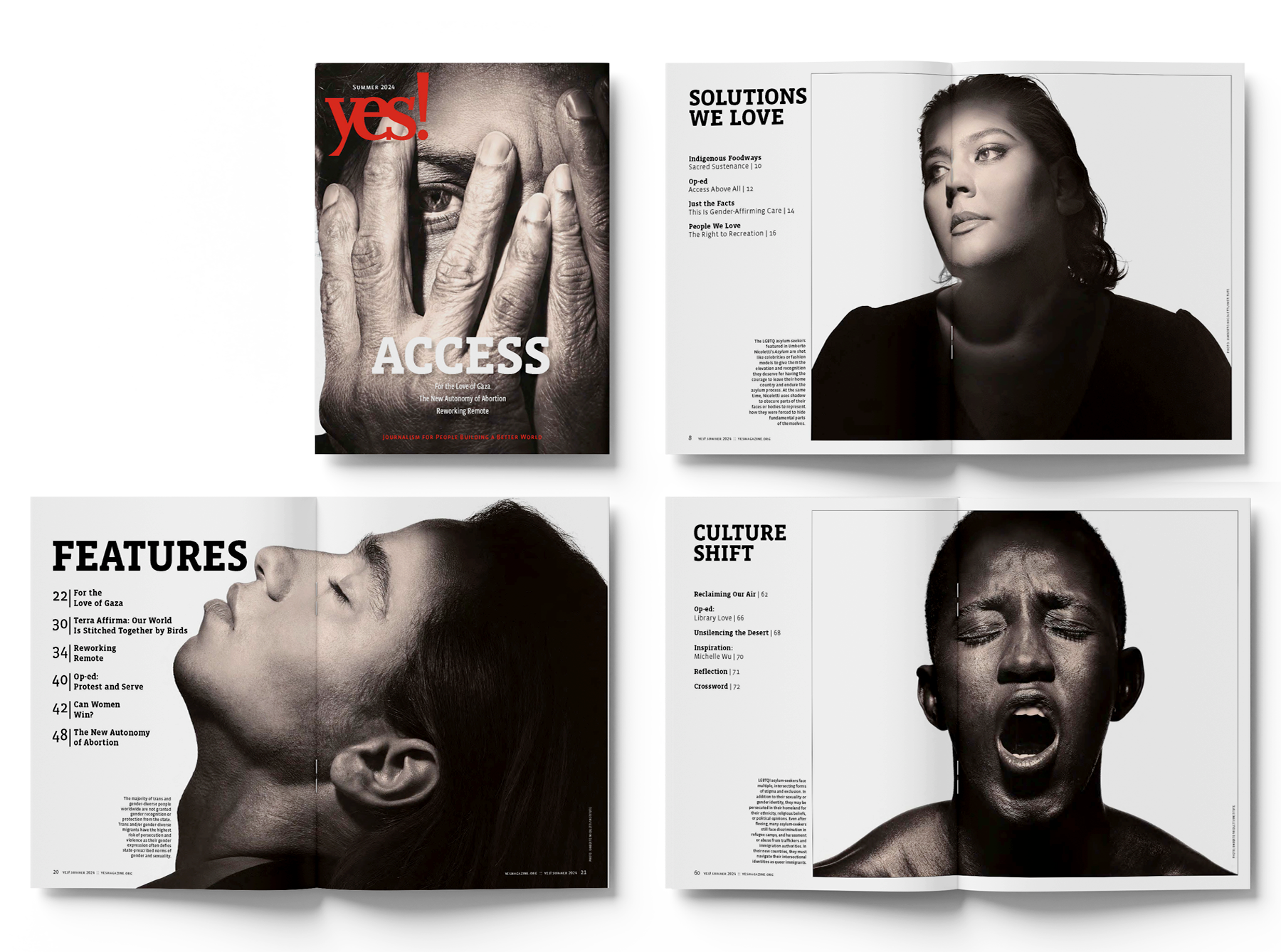
THEME: ACCESS (Summer 2024)
Amid a resurgence of anti-immigrant rhetoric and violence, I chose Umberto Nicoletti’s striking portraits to center the dignity, complexity, and vulnerability of LGBTQ asylum-seekers—people whose lives are too often politicized or erased. These images reject narrow, criminalizing narratives of who migrants are and instead invite a deeper understanding of asylum as an act of courage, identity, and survival.
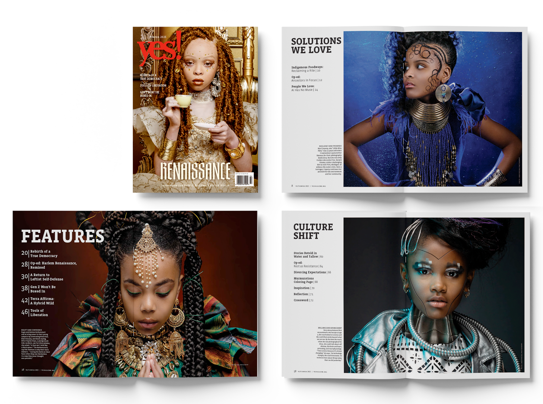
THEME: Renaissance (Winter 2025)
This final print issue is the one I’m most proud of. "Renaissance" evokes rebirth through culture—where beauty, art, science, and possibility converge. I selected portraits of young changemakers for the cover and section openers because each embodied a future shaped by imagination, brilliance, and courage. The portraits served as a visual thread, connecting the cultural power of individual transformation with the collective power of systemic change.
The Renaissance issue was the final print edition of YES! Magazine. In many ways, it made a bold, declarative statement about who YES! was becoming—and the future we believed was still possible.
This issue was produced during the 2024 presidential election cycle, a moment of profound national uncertainty. By the time it went to print, we didn’t yet know whether Kamala Harris or Donald Trump would emerge as the next president. The U.S. was actively funding Israel’s war on Palestine, and at home, we were contending with deepening ideological division, violent disruptions, and rising acts of hate and mass murder.
Our executive editor framed the issue this way: “In these times—and always—it’s essential to fortify our bonds to one another and to our collective vision for a world in which we’re all able to thrive. So rather than feeding pervasive pessimism, our Renaissance issue aims to elevate the people, experiences, and moments that signal where we’re moving.”
This issue acknowledged the urgency of the political moment—and the creative, communal resilience it demanded from us.
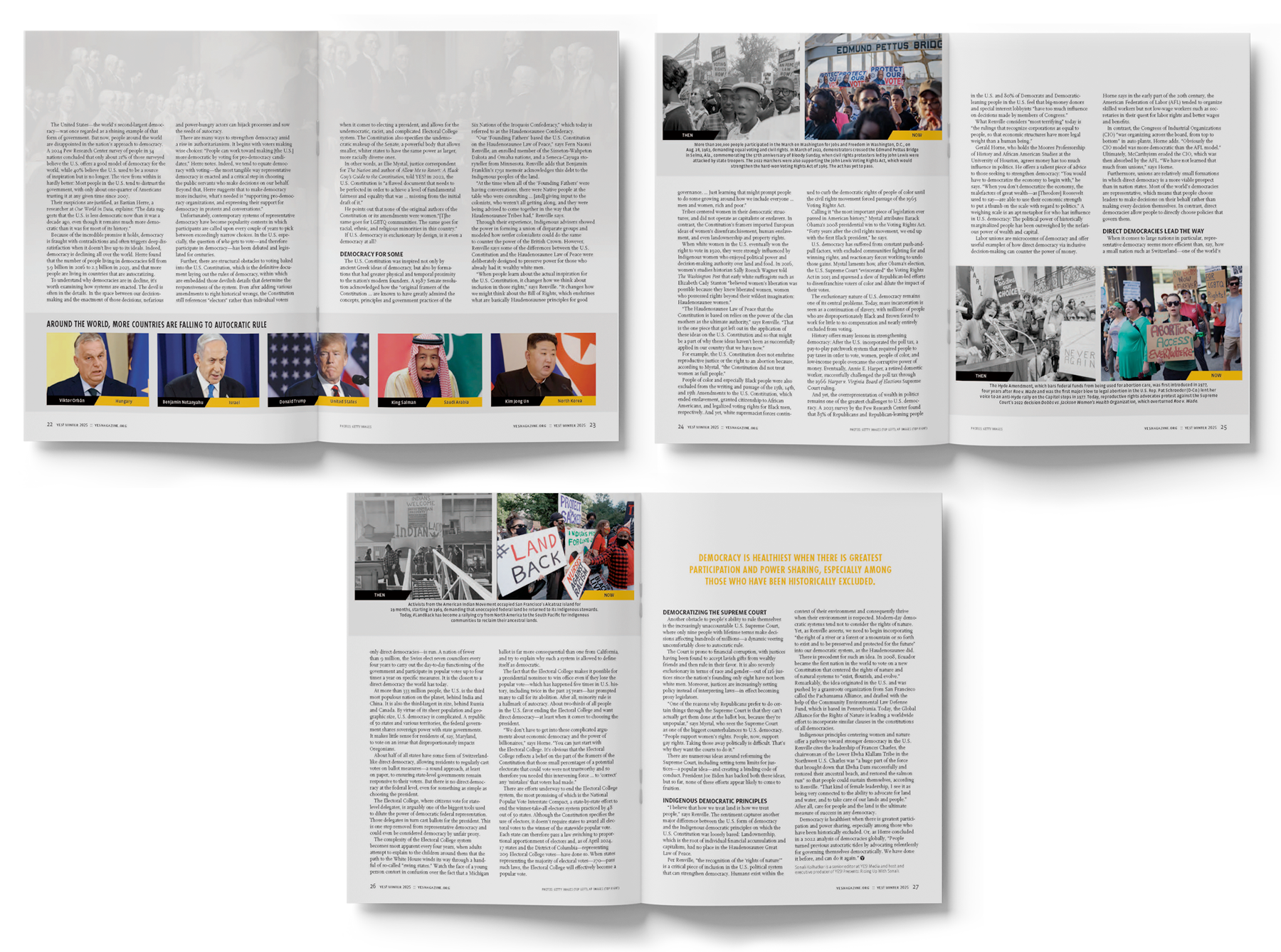
At a time when the organization was in steep financial decline, budget cuts required a more resourceful approach to visuals. I prioritized powerful stock photography, existing archives, and donated artwork that could still deliver emotional and narrative depth.
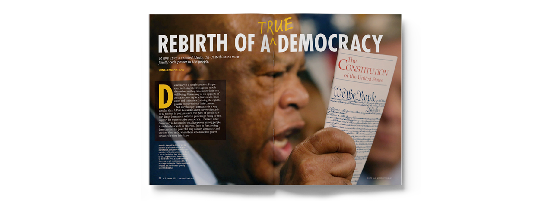
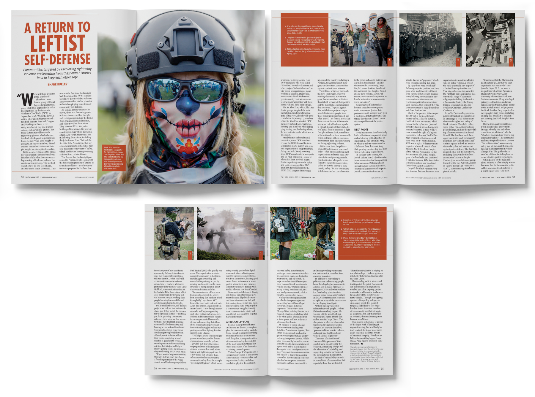
The lead feature, A Return to a Leftist Defense, opens with a striking portrait of a counterprotester in Portland, geared up to defend his city from an impending Proud Boys rally. The imagery traces the legacy of citizen-led protection movements, including the Jewish Labour Bund and the Black Panther Party, while also illustrating how today’s youth are reviving those traditions of self-defense in response to modern threats.
MAGAZINE REDESIGN
CLIENT: Lambda Legal
TASK: Creative Direction, Editorial Redesign, Template + System Development
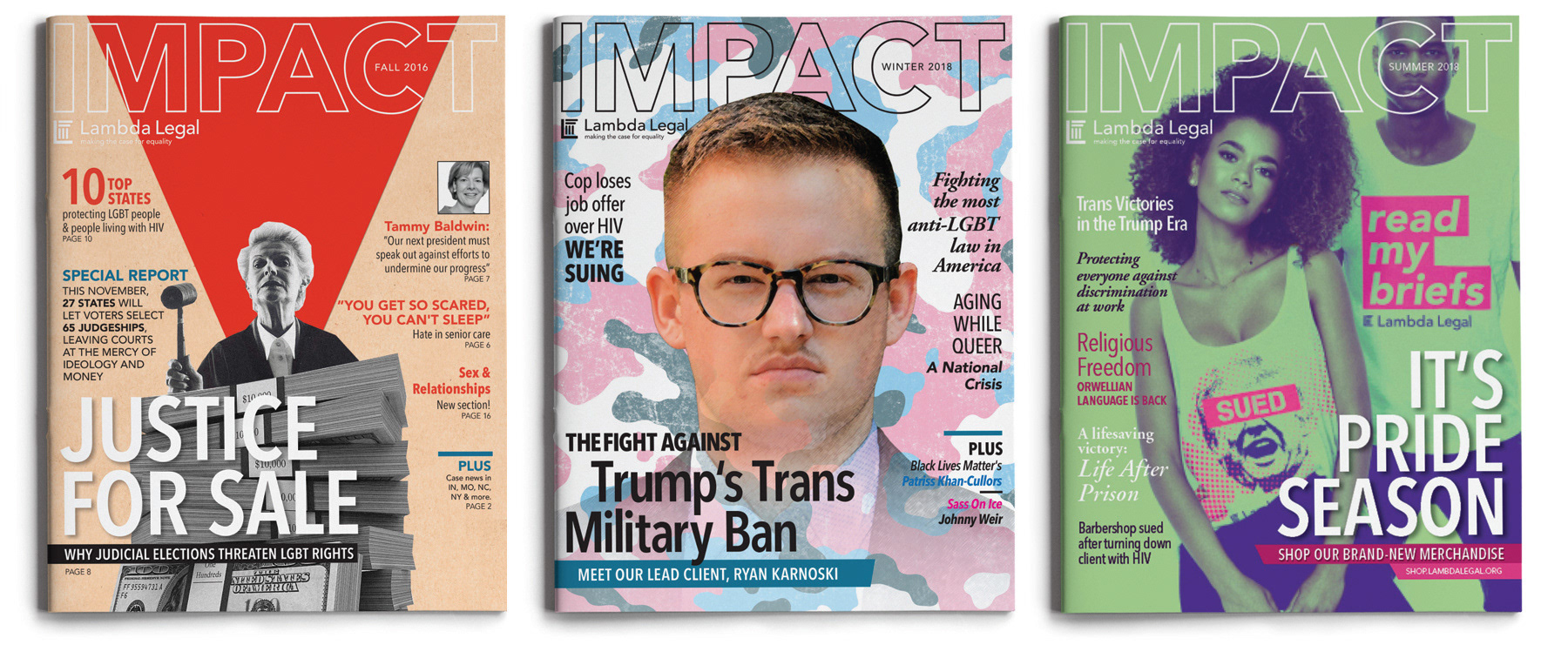
Hired initially to design Lambda Legal’s Annual Report, I was later entrusted with full creative responsibility for their quarterly donor magazine. After a few issues, I identified opportunities to improve their design system—streamlining the template, elevating typography, and creating a more cohesive visual experience. Leadership green-lit a full redesign, giving me full creative direction to overhaul the magazine’s layout, structure, and visual tone. I developed a reusable template library, implemented a new grid system, and refined their approach to imagery, hierarchy, and pacing—ultimately delivering a publication that aligned more strongly with the organization’s voice and mission.
(BEFORE)

(AFTER)